

- Free Article: No
- Contents Category: Non-fiction
- Custom Article Title: After Heide
- Review Article: Yes
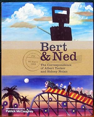
- Article Title: After Heide
- Online Only: No
- Custom Highlight Text:
A book of letters between ‘Bert’ and ‘Ned’ resonates nicely with the famous letters of Smike to Bulldog, published in 1946, the year young Albert Tucker completed his first images of Modern Evil, and Sidney Nolan began his first Ned Kelly paintings. The fascination of this correspondence, between artists destined to be as famous for their period as Arthur Streeton and Tom Roberts for theirs, is that it shows them flirting. ‘Bert’ tries to be graceful, ‘Ned’ to be scrupulous; both with an eye to history.
- Book 1 Title: Bert & Ned
- Book 1 Subtitle: The correspondence of Albert Tucker and Sidney Nolan
- Book 1 Biblio: Miegunyah Press, $49.95 hb, 263 pp, 0522852610
- Book 1 Cover Small (400 x 600):
- Book 1 Cover (800 x 1200):
McCaughey tells the story of a tie forged in Melbourne in the 1940s, when they were drawn into the Heide circle of John and Sunday Reed. Tucker’s baby son, Sweeney, was taken over, then formally adopted, by the Reeds. Nolan, after several years of living in a too-close threesome with Sunday and John, tore himself free in 1947. The Reeds acted their ambiguous roles in the name of art, but ended up separating both young men from wife, child and home city. Nolan and Tucker suffered deeply. Neither was able to forgive the Reeds, yet so far as their art was concerned they owed them a great deal.
The need to confide in the only other person who would understand is apparent in letters exchanged by the two men in the aftermath of Heide. ‘I still cannot trust myself to speak of her,’ wrote Tucker of Joy Hester. ‘I think of her and Sweeney constantly and it is not good that I do. As for telling me about her … I will leave to your discretion what you think you should tell me.’ Nolan in turn confided, ‘Cynthia & I were married about four weeks ago after not knowing each other for so very long, but it seems simple for us both and something like the peace that one had tucked away somewhere … My life seems to have moved away from Melb permanently … You know enough Bert to understand without my going into detail, although as time goes on there are probably other things which can be said further.’
The correspondence fired again following a ‘very important meeting’ in Rome in 1953, when they evidently agreed to seize their chances in Europe but to keep a watching brief on the risks of staying away from Australia. ‘I too will be a “foreign artist resident abroad”,’ quipped Nolan. His sense of being an outlaw and vulnerable was patent when he began to sign his letters ‘Ned’; and Bert indicated his fellowship by responding – ‘Dear Ned’. In those early years Tucker, who had been longer on the continent, took control. He encouraged Nolan, ‘We’ll make old Europe sit up and take notice yet.’ He roundly criticised Australian paintings at the 1954 Venice Biennale (Nolan was one of the artists represented): ‘too much Australia in the subject matter and not enough to the painting.’ Nolan took the message: ‘Doubtless this is why one has come abroad … and the only baggage that one is allowed to travel with is style.’
Five years later, Nolan had lost interest in the expatriate question though his loyalty to Tucker was as firm as ever. Writing about the desire provincial artists had ‘to absorb Europe’, he rallied his friend: ‘I remember you saying once that it took seven years. It does, almost to the month.’ Now that he was well established, whereas Bert had to wait a few years for a like success, he urged Tucker towards a concept of expatriate experience that embraced a feeling for nature and story, not just style: ‘I think quite a bit about D.H. Lawrence … He is related to ourselves in some curious way.’
In the introductory chapters, McCaughey lucidly interprets some of the signs of personality and life revealed by the letters. The book is provided with an index, copious footnotes and Notes of Persons, in careful librarian style. The attention-grabbing design is singularly inappropriate. Its one good feature is that the illustrations (someone’s brilliant selection) are located precisely where they belong in the text.
Comments powered by CComment